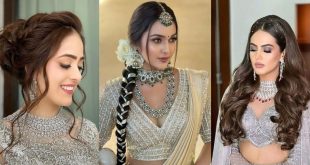
A wedding isn’t just a union of two souls, it’s also a beautiful blend of colors, cultures, and emotions. From the décor to the outfits, every detail plays a vital role in creating a cohesive and enchanting celebration. Among all, color coordination in wedding outfits can truly elevate the visual harmony of the event. Whether you’re a couple tying the knot, part of the wedding party, or a guest aiming to complement the theme, knowing how to coordinate colors thoughtfully can make all the difference.
In this expert guide, we’ll explore how to choose colour-coordinated wedding outfits that look stunning, feel authentic, and photograph beautifully.
1. Begin with the Wedding Theme and Venue
The first step in achieving a cohesive color palette is to consider your wedding theme and venue. The setting largely influences how colors appear and interact with natural light.
-
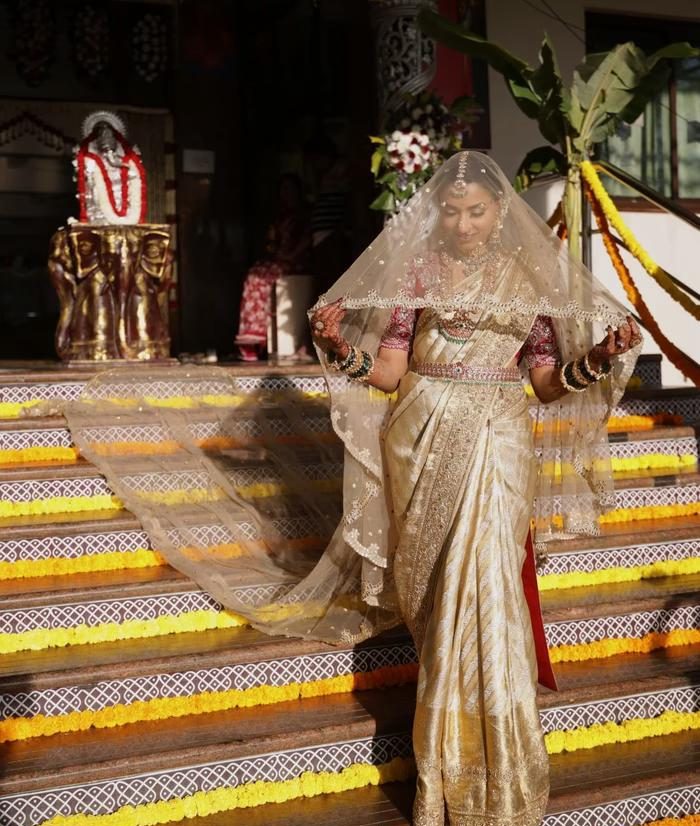
Beach or outdoor weddings look magical with pastel shades like blush pink, mint green, ivory, and powder blue.
-
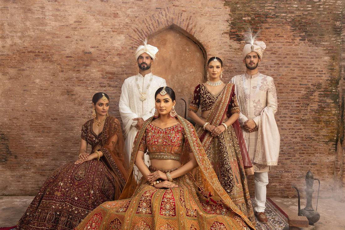
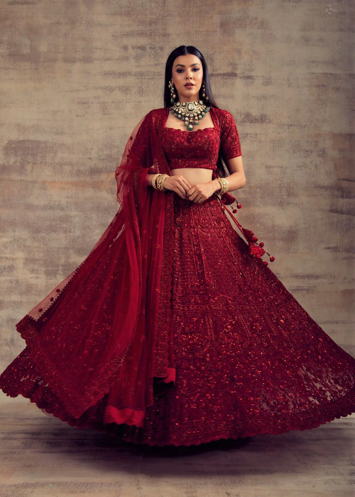
Palace or heritage weddings shine with royal tones such as maroon, emerald green, navy blue, and gold.
-
Rustic or boho weddings can be complemented with earthy hues like terracotta, olive, and beige.
Your surroundings are part of your wedding story, so let them inspire your color palette naturally.
2. Pick a Signature Color and Build Around It
Every couple should have one standout or signature color that defines their wedding vibe. Choose a shade that reflects your personality as a couple, it could be romantic, regal, or minimalistic.
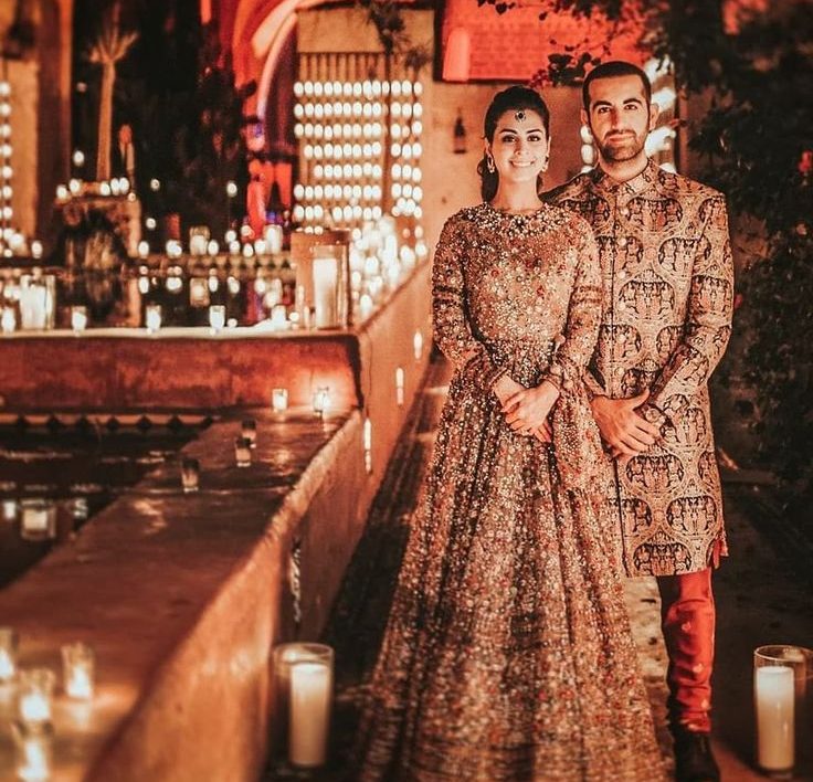
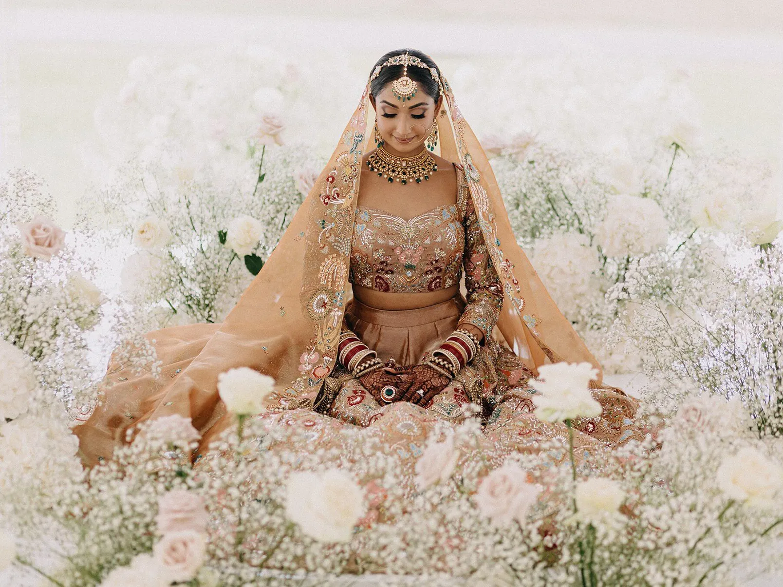
Once your primary color is chosen, build your palette with complementary or contrasting tones. For instance, a deep wine shade can be paired with gold for grandeur, or blush pink with ivory for understated elegance.
This approach ensures your outfits look unified without feeling too “matchy.”
3. Choose Colours That Complement Skin Tones
A professional colour-coordination tip is to consider skin tones.
-
Warm undertones look radiant in coral, mustard, maroon, and olive.
-
Cool undertones glow in lavender, teal, silver, and baby pink.
Your outfit should highlight your natural beauty rather than overpower it. When both partners look radiant in their respective shades, the coordination automatically feels organic and balanced.
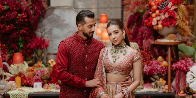
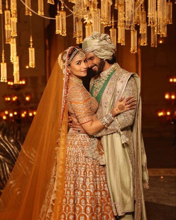
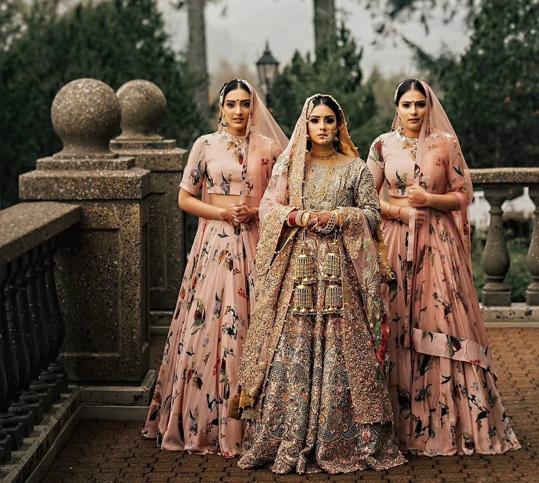
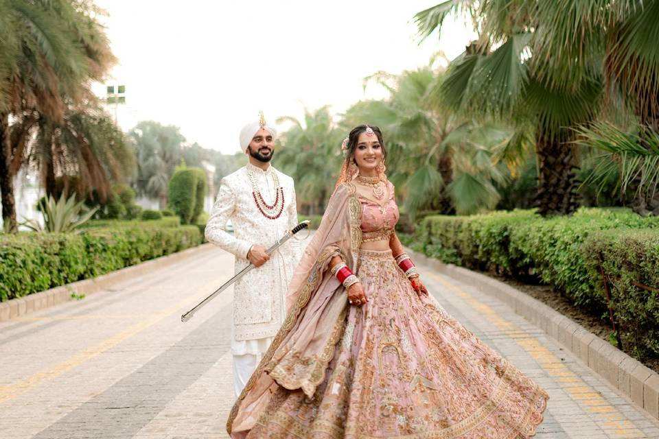
4. Coordinate, Don’t Copy
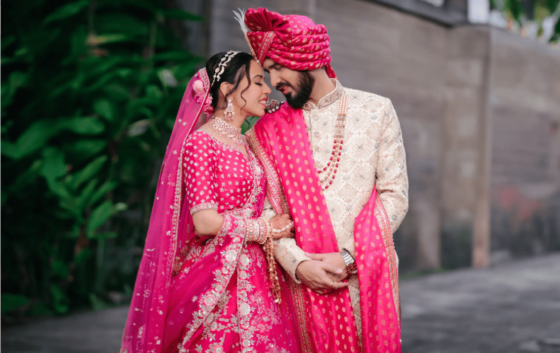
Matching outfits from head to toe can look repetitive. The modern trend is coordination with variation.
If the bride wears a blush pink lehenga with gold embroidery, the groom could opt for an ivory sherwani with a pink stole or pocket square. The goal is to create visual connection through subtle color accents rather than identical outfits.
This approach photographs beautifully and reflects individuality while maintaining harmony.
5. Play with Contrasts
Contrasts add visual depth and excitement to your wedding look.
-
Classic red paired with ivory or beige is timeless.
-
Deep blue and gold exude sophistication.
-
Pastel combinations like peach and mint green are ideal for daytime ceremonies.
When using contrast, keep one outfit as the dominant color and use the other as a complementing tone. This helps maintain balance without clashing.
6. Coordinate with the Wedding Party
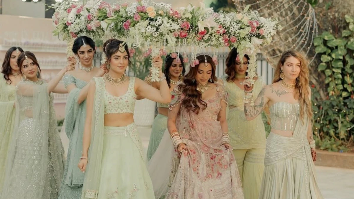
Your bridesmaids and groomsmen are extensions of your theme. Coordinate their attire with your chosen color palette. For example:
-
Bridesmaids can wear dresses in varying shades of lavender, mauve, or rose.
-
Groomsmen can match ties, turbans, or pocket squares with these tones.
This creates a visually harmonious setting during photographs and ceremonies.
7. Align with the Season and Time of Day
Colors react differently depending on the season and lighting.
-
Morning weddings: Softer tones like peach, sky blue, or mint.
-
Evening or winter weddings: Rich jewel tones like emerald, ruby, and navy.
During summer, lighter colors keep you comfortable and vibrant, while deeper hues suit colder or evening setups beautifully.
8. Add Metallic Accents Thoughtfully
Metallics like gold, silver, and rose gold can act as the perfect bridge between different colors.
-
Gold complements warm palettes such as red, orange, and green.
-
Silver blends seamlessly with cooler tones like blue, purple, and grey.
Metallic embroidery, dupattas, or jewelry can enhance coordination without overwhelming the outfit.
9. Balance Embroidery and Prints
When one outfit is heavily embroidered or printed, balance it with something subtle. For example, if the bride’s lehenga is intricately designed, the groom can wear a solid-colored sherwani with a matching embroidered stole.
Balancing heavy and light elements ensures both outfits stand out without competing for attention.
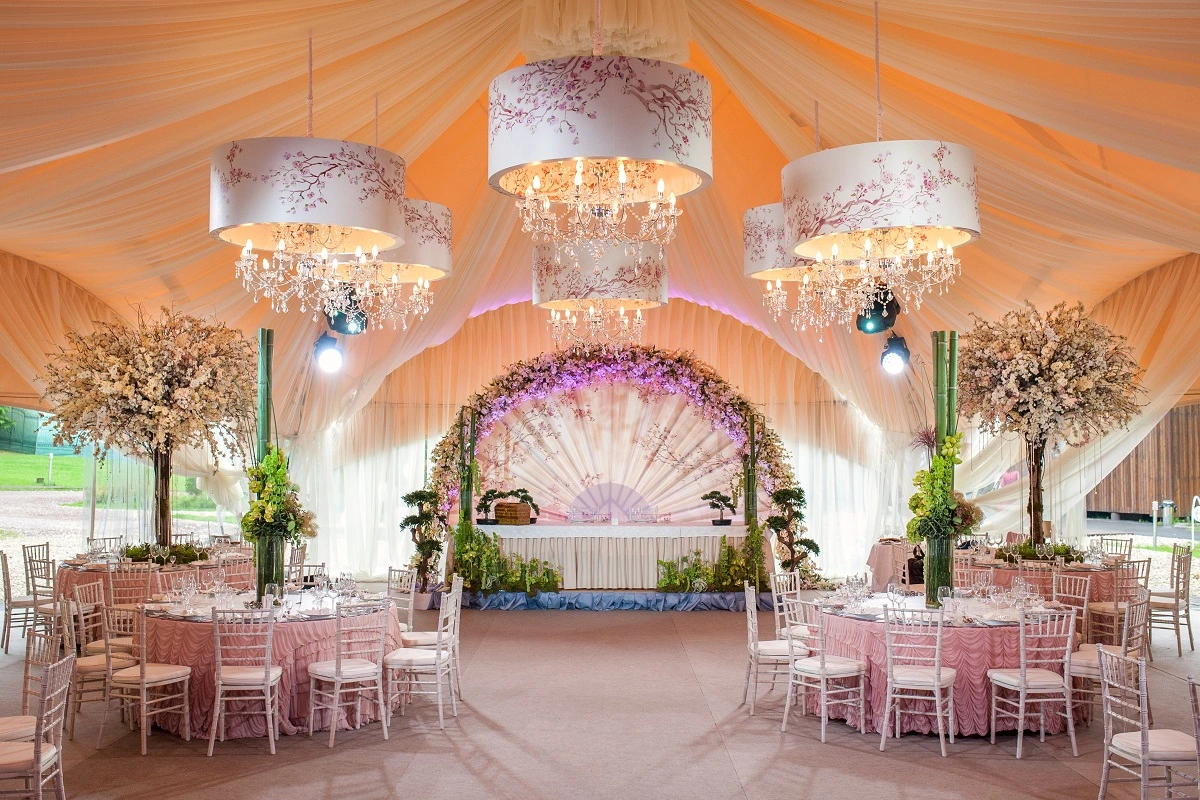
10. Reflect the Décor and Wedding Mood
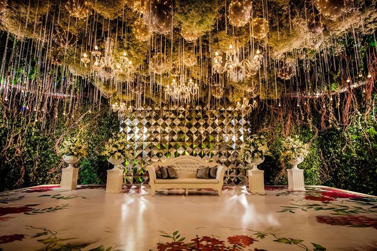
A cohesive wedding palette connects décor, outfits, and ambiance. If your décor features floral pastel arrangements, matching soft tones in your outfits can enhance the visual experience.
Similarly, bold décor themes with jewel tones can be echoed through rich outfit colors. This alignment ensures that your wedding photos have a seamless, magazine-worthy aesthetic.
11. Test Colors Under Lighting
Before finalizing, test your chosen colours under various lighting conditions, natural daylight, indoor lighting, and flash photography. Some colours appear differently on camera, so ensure they look flattering in every setting.
This step prevents surprises and guarantees flawless photographs.
12. Personalize with Details
Add personal touches that symbolize your love story. Custom embroidery, initials, or motifs can make your outfits truly unique. Matching accessories, like the same floral pattern on the bride’s dupatta and groom’s pocket square, create subtle coordination that looks classy and intentional.
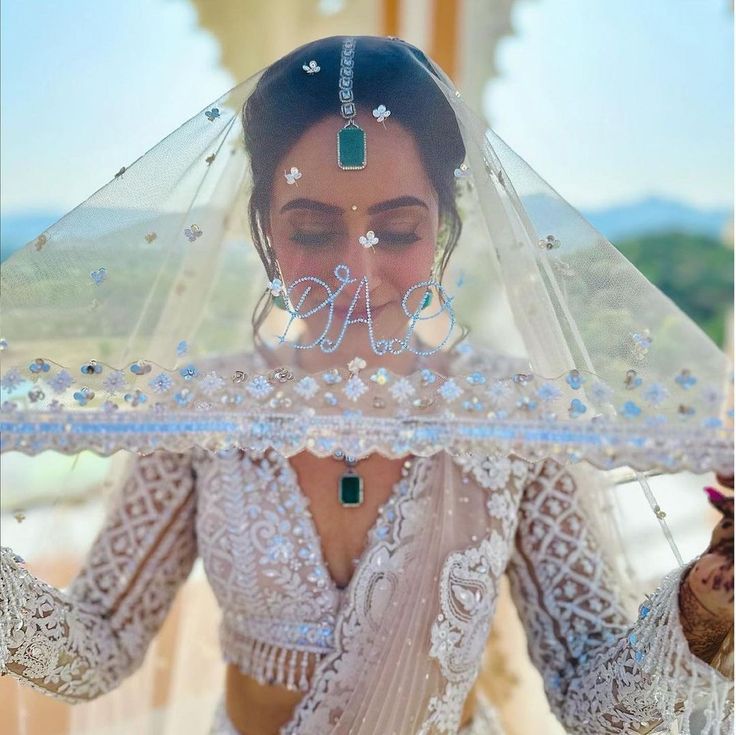
13. Accessorize for Harmony
Accessories like jewellery, footwear, and dupattas complete your look. If your partner wears a deep emerald outfit, adding emerald jewellery or bangles can tie both outfits together beautifully. Small touches go a long way in creating a cohesive look.
14. Comfort Over Everything
Even the most stunning outfit won’t shine if you’re uncomfortable. Choose breathable fabrics like georgette, silk blends, or organza that allow you to move freely. Weddings are long, and comfort ensures confidence—which is the most elegant accessory you can wear.
15. Consult an Expert or Designer
If you’re unsure about colour theory, seek professional help. Stylists and designers can suggest palettes that match your personality, body type, and venue theme. They also help ensure the colors flow seamlessly across the couple’s outfits and the overall event aesthetic.
Conclusion
Color coordination in wedding outfits is more than a fashion choice—it’s an expression of unity and aesthetic harmony. Whether you prefer vibrant traditional tones or minimalist modern hues, the key lies in balance, personalization, and thoughtful planning.
Your wedding attire should feel like an extension of your story—vibrant, connected, and timeless. And if you’re looking for a venue that complements your color palette and vision, Venuelook can help you find the perfect match. From elegant banquet halls to open-air lawns and décor experts, Venuelook ensures that your wedding is not only color-coordinated but also beautifully curated.
FAQs
Q1. How do couples decide on a wedding color palette?
Couples can start with their wedding theme, venue décor, and personal preferences. Choose a primary color and build complementary or contrasting shades around it.
Q2. What colors are trending for weddings in 2025?
In 2025, pastel tones like dusty rose, sage green, and powder blue are trending, along with luxurious jewel tones such as emerald and wine for evening weddings.
Q3. Should the bride and groom wear matching outfits?
Not necessarily. Coordination through similar tones, patterns, or accessories looks more elegant than identical outfits.
Q4. What color combinations work best for photographs?
Balanced combinations like blush and gold, ivory and emerald, or navy and champagne photograph beautifully under all lighting conditions.
Q5. How can Venuelook help with color-themed weddings?
Venuelook connects you with venues and décor vendors that match your color scheme and style—helping you design a cohesive, picture-perfect wedding setup.
Book the best Bridal wear in your city, contact us at venuelook.com/bridal-wear/delhi/vendors
For value-for-money A-Z of wedding planning and decorations, contact us at weddings.venuelook.com
You May Also Like:
- Trending Pagphera Outfit Inspirations for Newlywed Brides
- Fabulous Blouse Designs for Every Bride
- Trendy Outfits to Style Yourself for an Indian Wedding
- Bridal Wear Inspiration From Around The World
- Easy Homemade DIY Masks for Brides To Be
- Bridesmaids Who Set Goals By Coordinating Their Wedding Outfits!
- Charming Indian Wedding Dresses For Brides-Sister
Have you sent out invitations for your upcoming event? If not, save paper and send free online invitations now.

Looking for a party venue? Browse and book best-suited party venues from VenueLook.com